How to ZZZ

A motion graphics video of how students can get better sleep

Disciplines: Motion Graphics

For this project, we were tasked to design a motion graphics video based on either a Creative Conscience brief or take a piece of text as the starting point. My team and I decided to go towards one of Creative Conscience’s topic which was health + well-being with our target audience being young adults (18-25 years old) that are currently studying.

I completed this project with Finlay Heanue, Millie Harvey and Oona Mcleary.

Research

Based on the chosen brief of health + well-being, I decided to do surface level research on subjects worth addressing. To spark inspiration for our video's theme, I watched several TED Talks that related to the brief, ultimately identifying four topics that we could go towards.

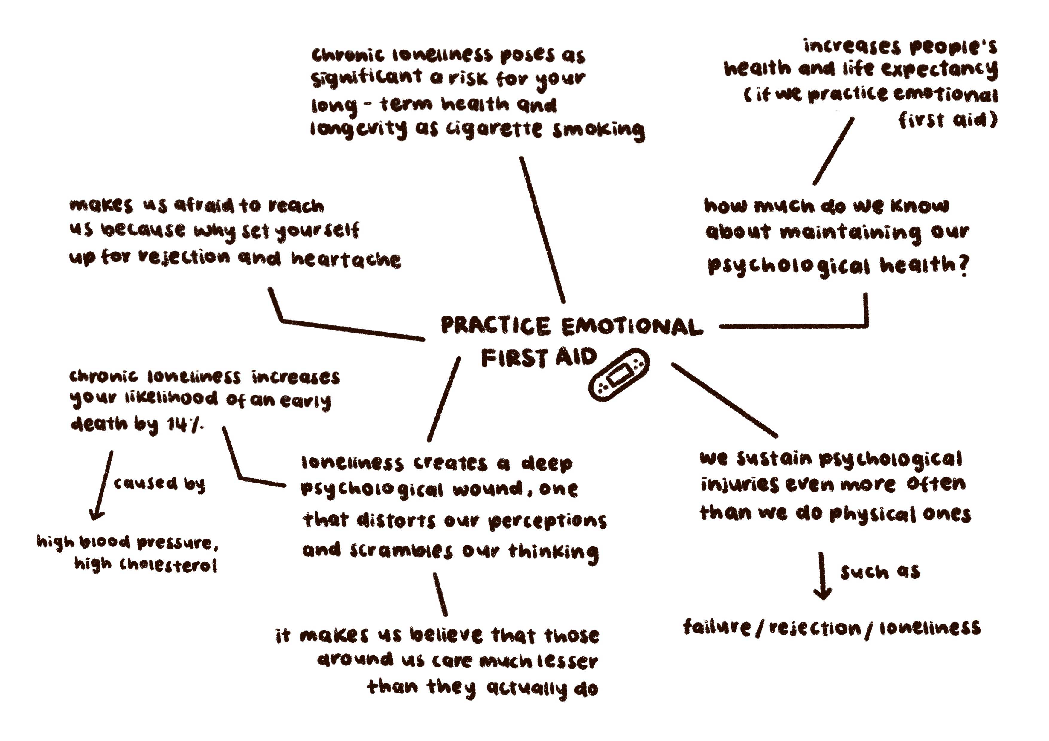
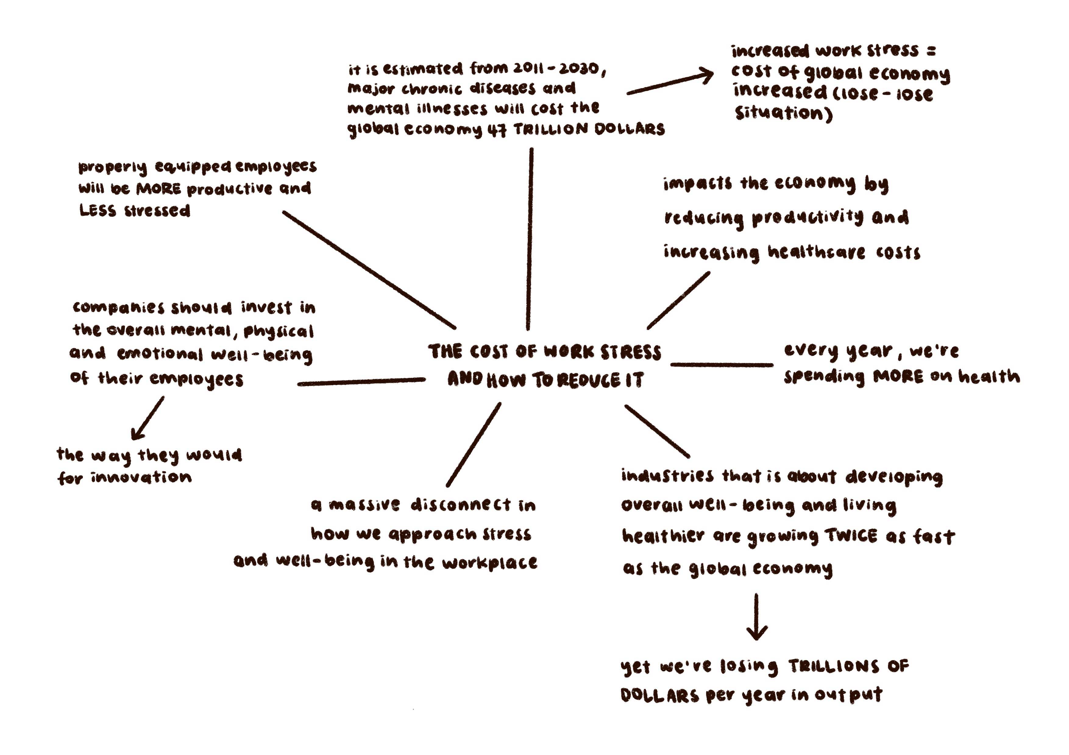
Depending on the main subject of the TED Talks, I decided to delve deeper into the subject and research on some things that could be interesting to show the team. Below are some mind maps I created based on subjects I found interesting.
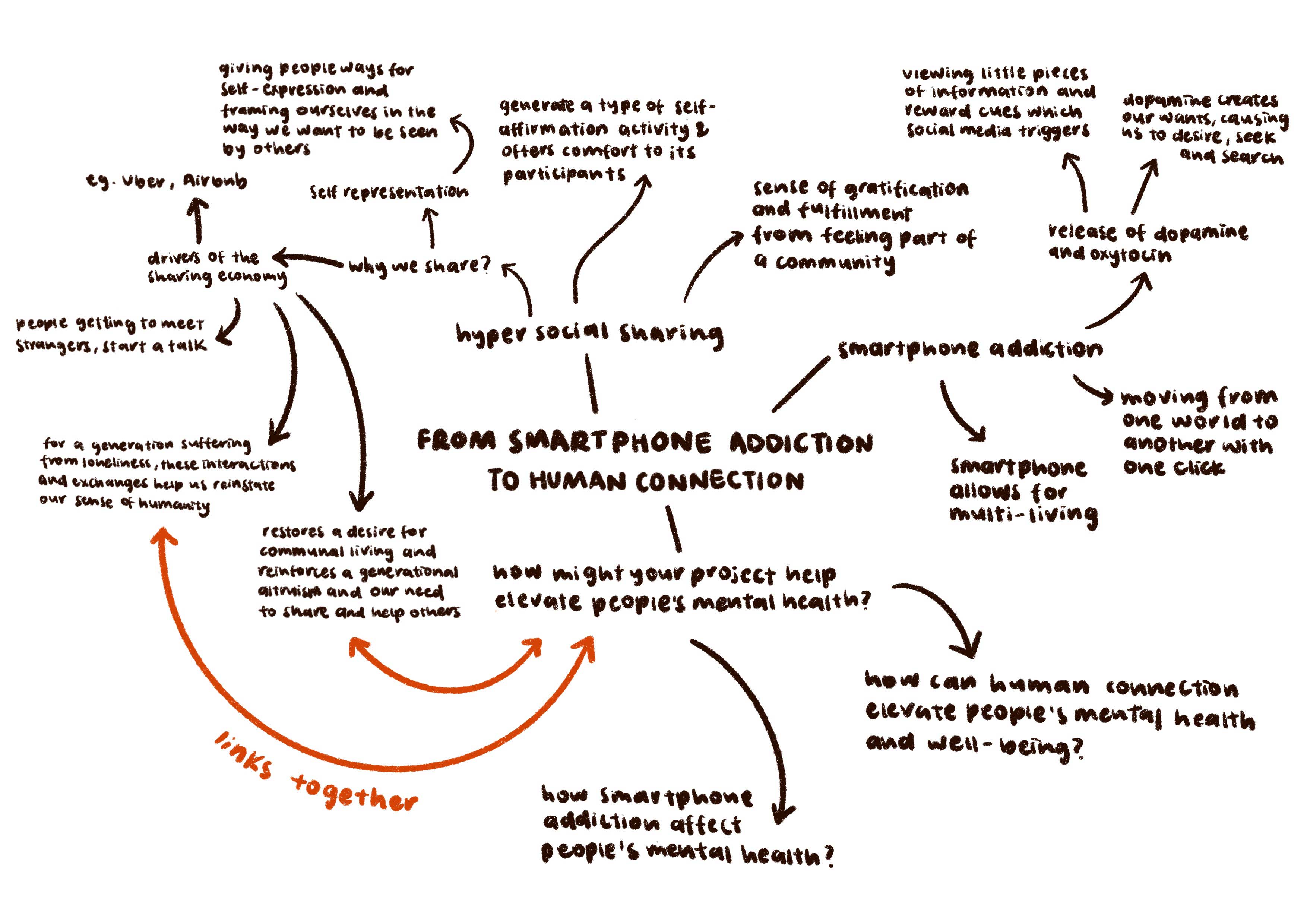
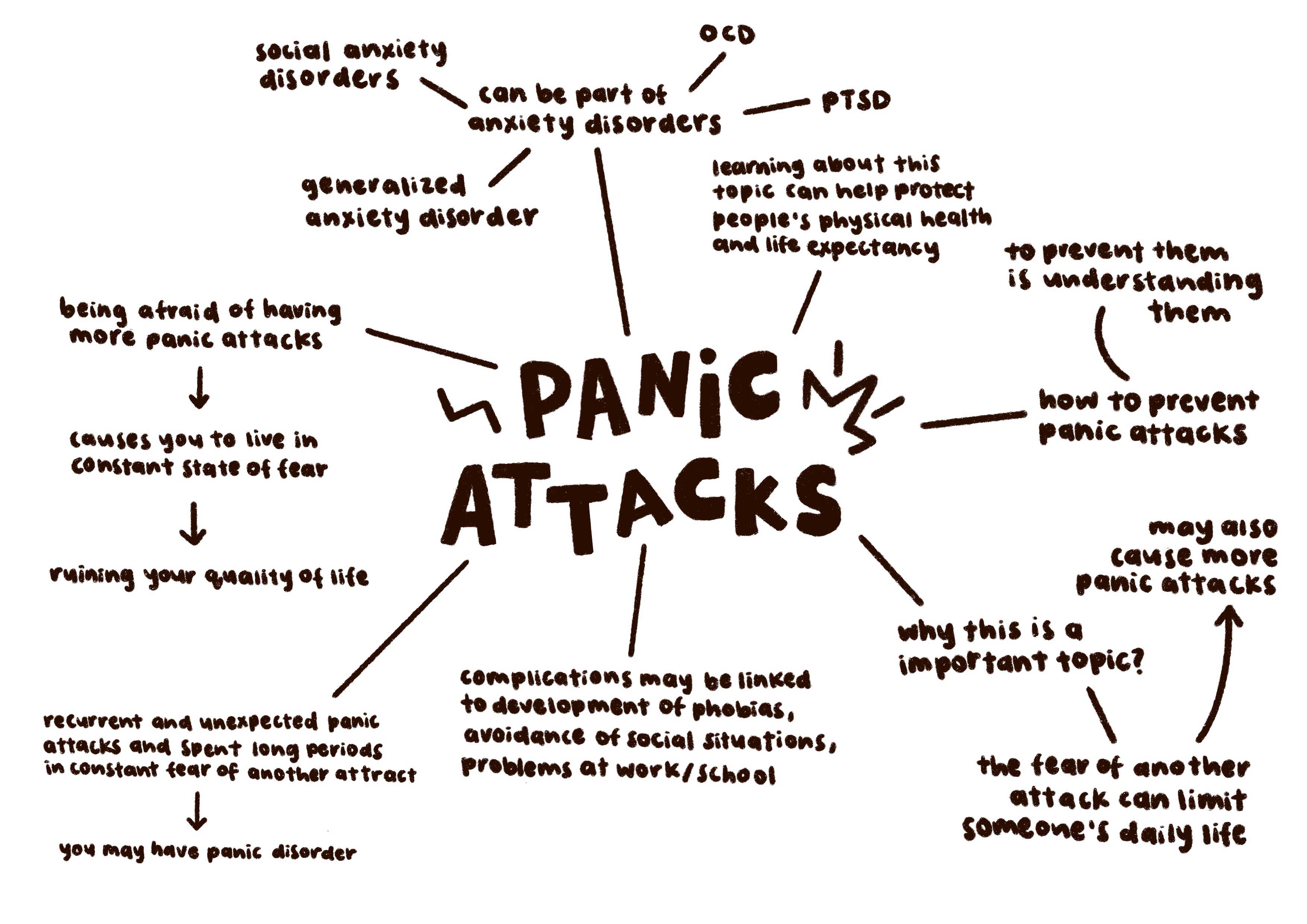
image of smartphone addiction mindmap
image of panic attack mindmap
image of emotional first aid mindmap
image of work stress mindmap

Our Concept

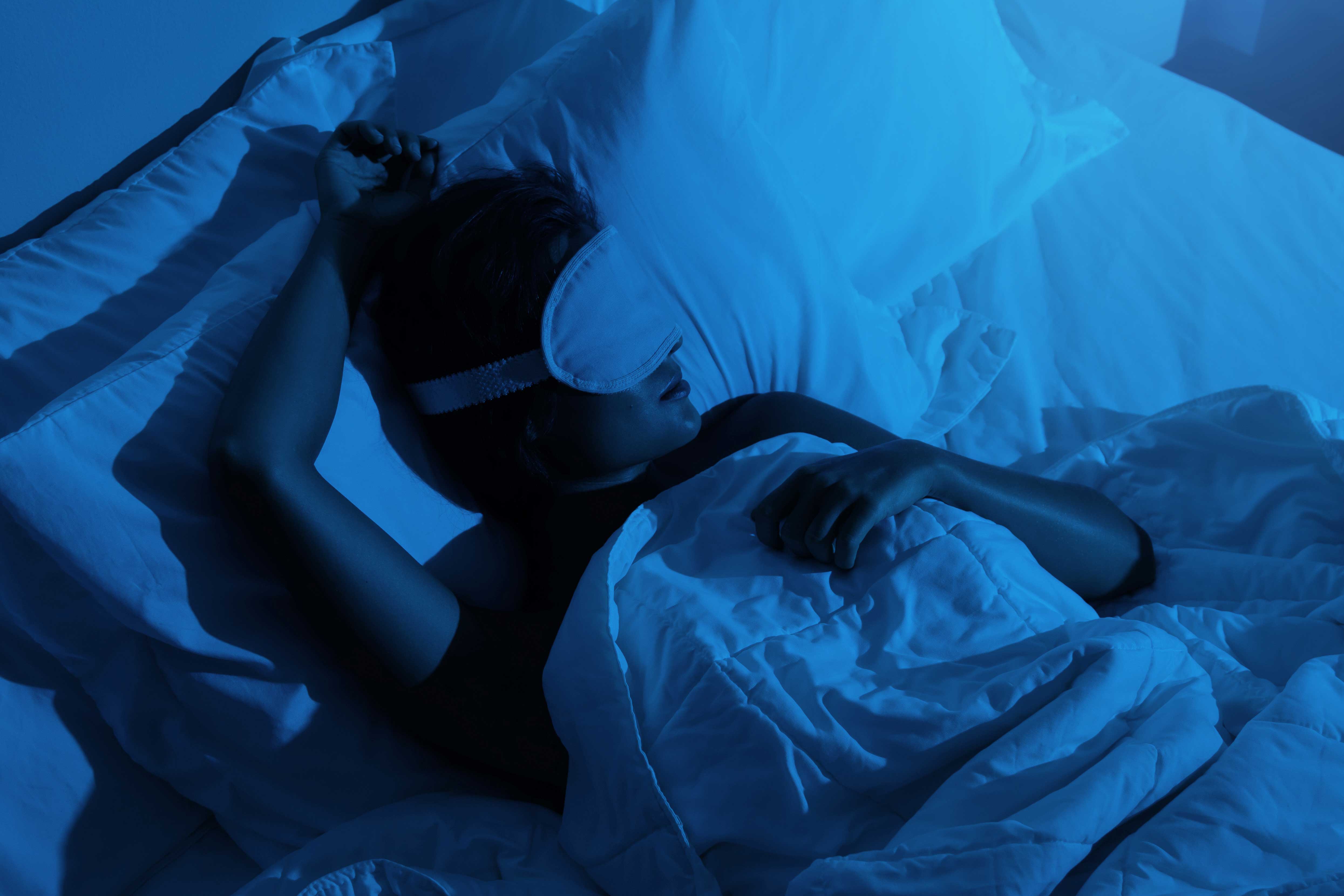
image of someone sleeping

Based on Oona's research about sleep, we decided to choose that topic because of its universal experience that resonates with everyone. We came to an agreement to go for a collage stop-motion style for the video.

Our Purpose

To increase awareness regarding the impact of insufficient sleep on students’ health and well-being, this video equips students with the knowledge and resources to make positive changes to their sleep habits.

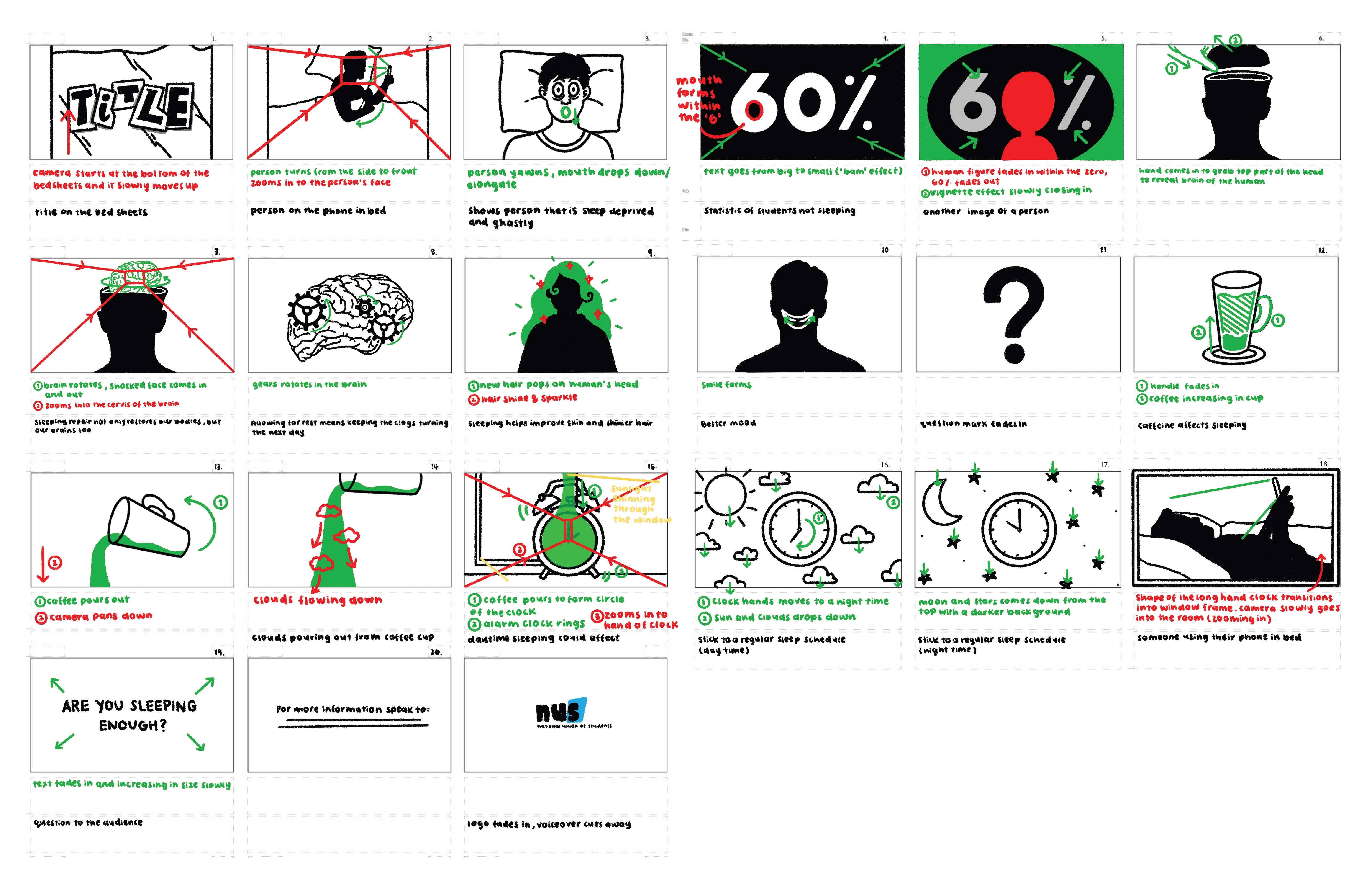
image of refined storyboard

Storyboard

stylised frames example 1
The stylised frames that I worked on
stylised frames example 2

Experimentation

image of experimentation 1
image of experimentation 2
image of experimentation 3

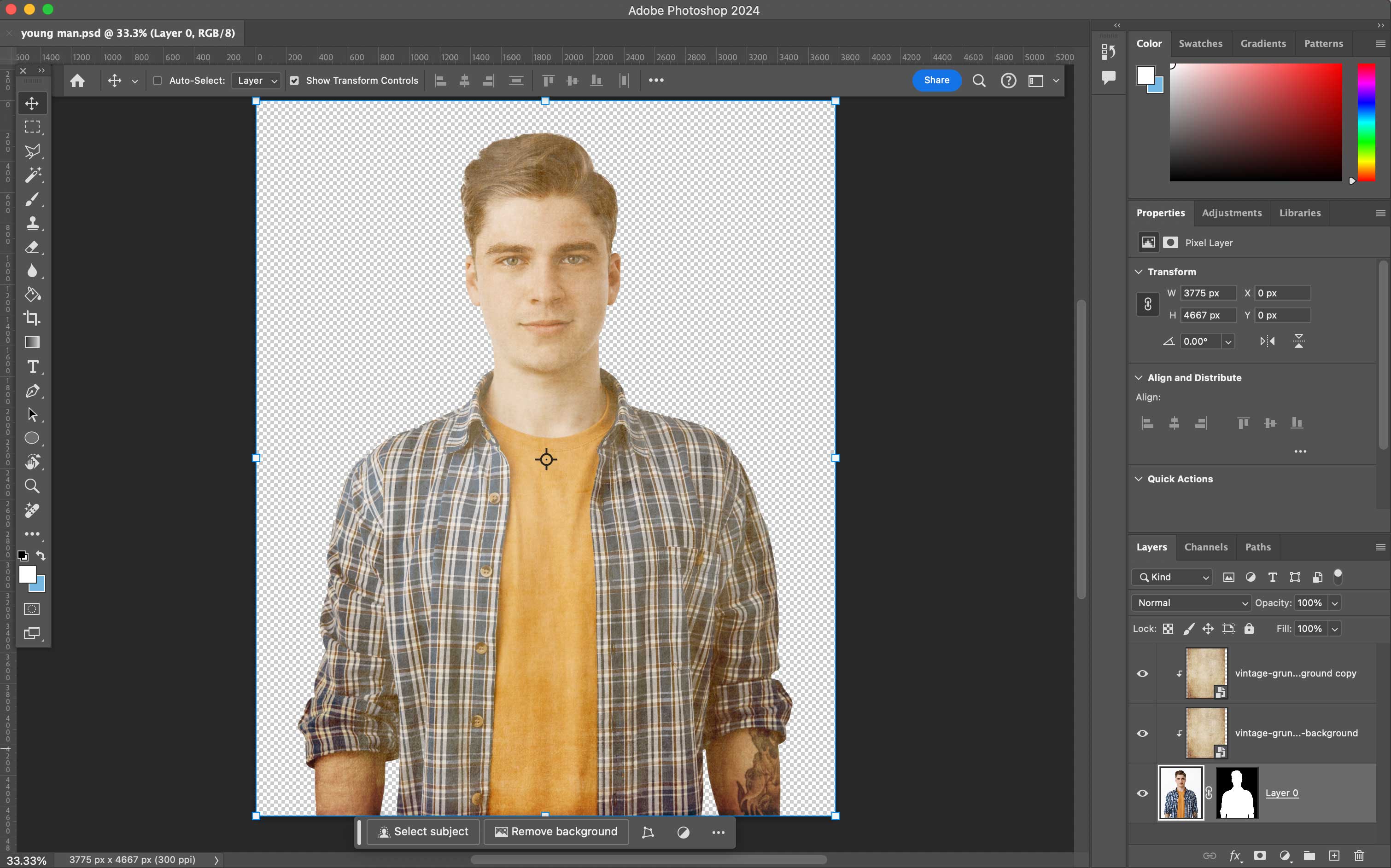
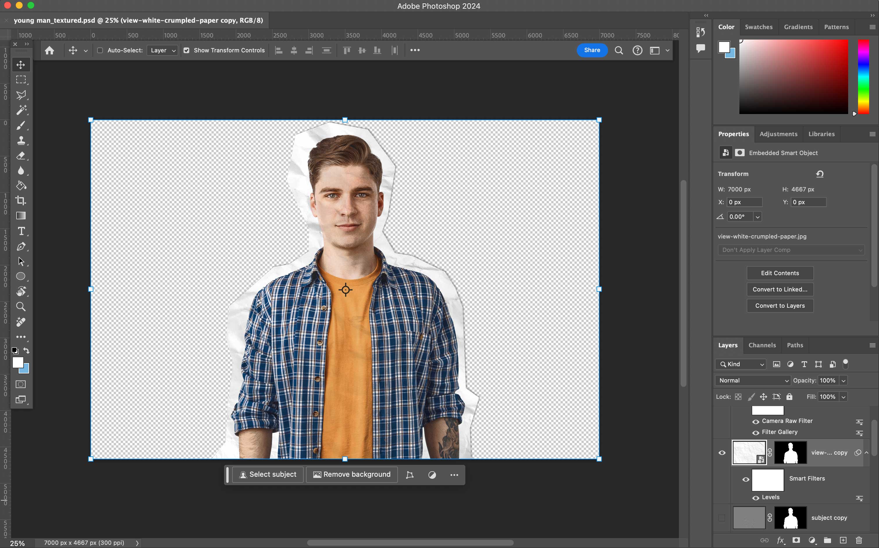
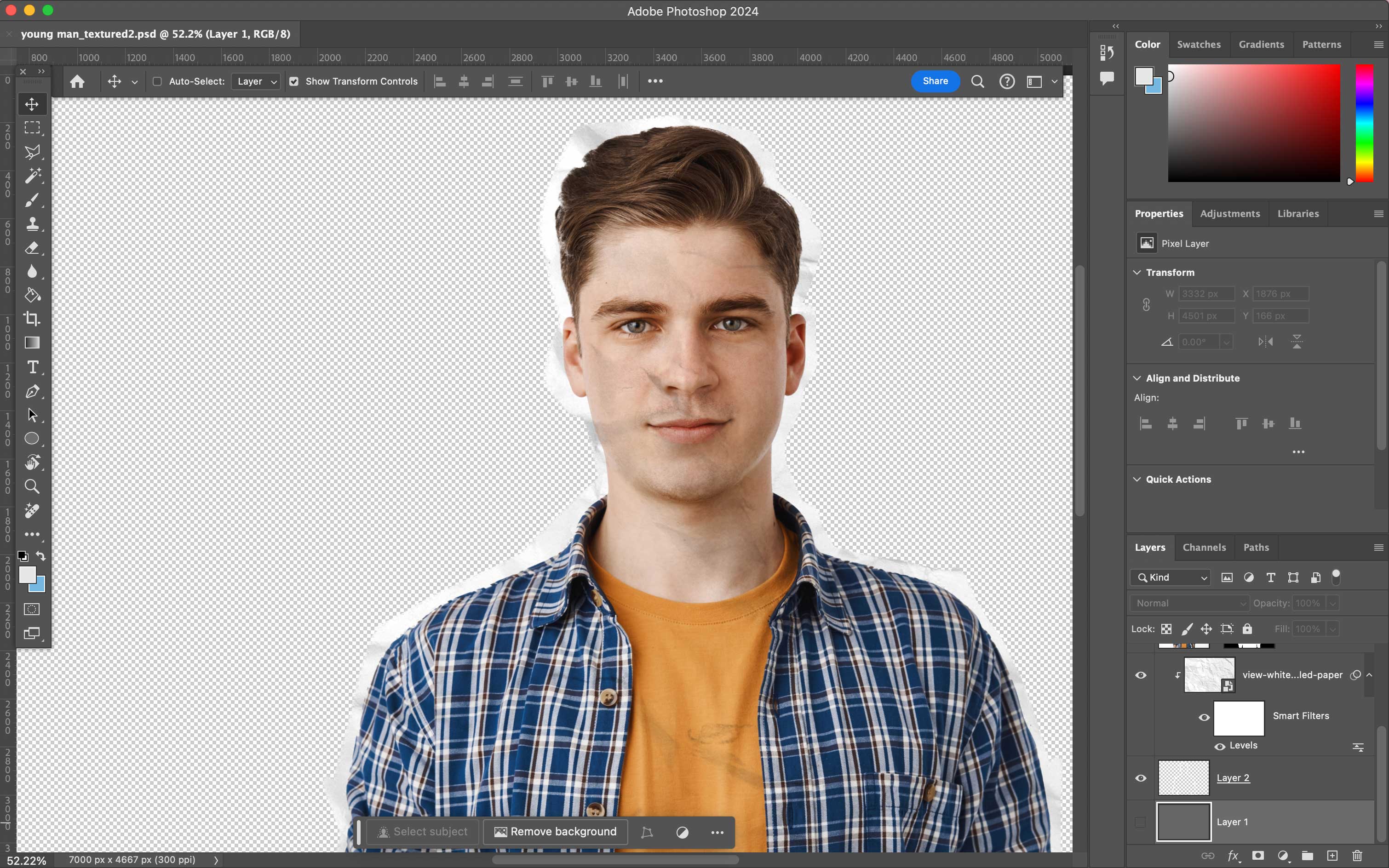
I experimented with paper cut styles to complement the desired look and feel of our style. Initially, I incorporated a vintage effect overlaying the original image of the man. However, following discussions with my team, we opted for a more distinctly cut-out appearance. Consequently, I created new iterations of the man with a paper cut-out effect enhancing them further with a textured paper overlay which was used in the final video.

image of photography session

Next Steps

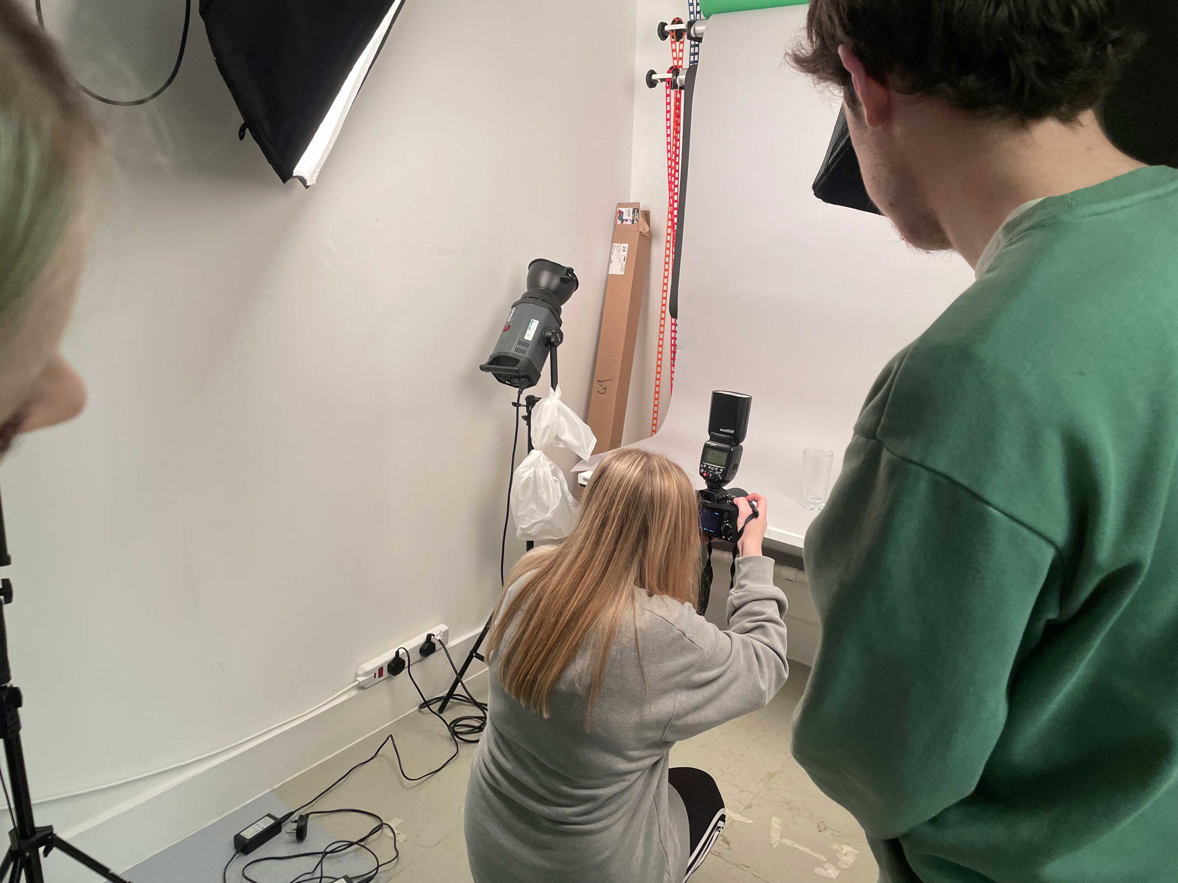
We decided to use our own photographs, so Millie enlisted the help of her friend from photography to assist us in taking the pictures.

Within my team, we allocated five frames to each member and I worked on frames 6-8, 17 and 18 (shown below).

gif of frames 6-8
gif of frames 16-17
gif of frames 15-16

For the final video, I compiled the frames from my team members as well as the voice over, sound effect and background music. Additionally, I color-graded the entire video ensuring a seamless blend of colors and textures for cohesion.

Other Projects

thumbnail of the sticker on your fruit project
The sticker on your fruit
thumbnail of hebereta brand logo
It takes a community
thumbnail of the story of your mealtime project
The story of your mealtime
↑ Back to top